细胞通讯图片美化:弦图、气泡图
常规可视化结果解读
弦图
rm(list = ls())
setwd("/mnt/DEV_8T/zhaozm/seurat全流程/cellchat/")

##禁止转化为因子
options(stringsAsFactors = FALSE)

## 设置保存的目录
## 数据目录
data_dir <- "/mnt/DEV_8T/zhaozm/seurat全流程/cellchat/data"
if (!dir.exists(data_dir)) {
  dir.create(data_dir, recursive = TRUE)
}
## 图片目录
img_dir <- "/mnt/DEV_8T/zhaozm/seurat全流程/cellchat/img"

if (!dir.exists(img_dir)) {
  dir.create(img_dir, recursive = TRUE)
}
## 加载包和数据
library(CellChat)
library(RColorBrewer)
library(ggplot2)
library(readr)
library(Seurat)
library(circlize)
library(ComplexHeatmap)
library(grid)
载入需要的程序包:dplyr


载入程序包:‘dplyr’


The following objects are masked from ‘package:stats’:

    filter, lag


The following objects are masked from ‘package:base’:

    intersect, setdiff, setequal, union


载入需要的程序包:igraph


载入程序包:‘igraph’


The following objects are masked from ‘package:dplyr’:

    as_data_frame, groups, union


The following objects are masked from ‘package:stats’:

    decompose, spectrum


The following object is masked from ‘package:base’:

    union


载入需要的程序包:ggplot2

载入需要的程序包:SeuratObject

载入需要的程序包:sp


载入程序包:‘SeuratObject’


The following object is masked from ‘package:BiocGenerics’:

    intersect


The following objects are masked from ‘package:base’:

    intersect, t


载入程序包:‘Seurat’


The following object is masked from ‘package:igraph’:

    components


========================================
circlize version 0.4.16
CRAN page: https://cran.r-project.org/package=circlize
Github page: https://github.com/jokergoo/circlize
Documentation: https://jokergoo.github.io/circlize_book/book/

If you use it in published research, please cite:
Gu, Z. circlize implements and enhances circular visualization
  in R. Bioinformatics 2014.

This message can be suppressed by:
  suppressPackageStartupMessages(library(circlize))
========================================


载入程序包:‘circlize’


The following object is masked from ‘package:igraph’:

    degree


载入需要的程序包:grid

========================================
ComplexHeatmap version 2.22.0
Bioconductor page: http://bioconductor.org/packages/ComplexHeatmap/
Github page: https://github.com/jokergoo/ComplexHeatmap
Documentation: http://jokergoo.github.io/ComplexHeatmap-reference

If you use it in published research, please cite either one:
- Gu, Z. Complex Heatmap Visualization. iMeta 2022.
- Gu, Z. Complex heatmaps reveal patterns and correlations in multidimensional
    genomic data. Bioinformatics 2016.


The new InteractiveComplexHeatmap package can directly export static
complex heatmaps into an interactive Shiny app with zero effort. Have a try!

This message can be suppressed by:
  suppressPackageStartupMessages(library(ComplexHeatmap))
========================================
## 读取文件
RE_CD4 <- readRDS(file = "./data/RE_cd4_cellchat.rds")
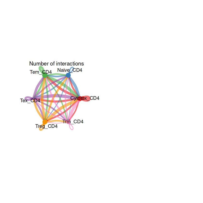
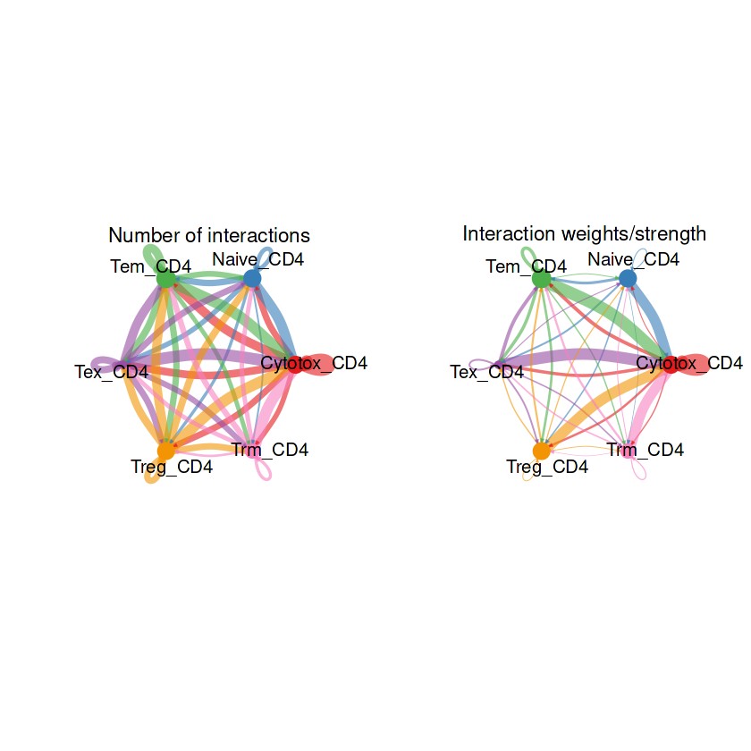
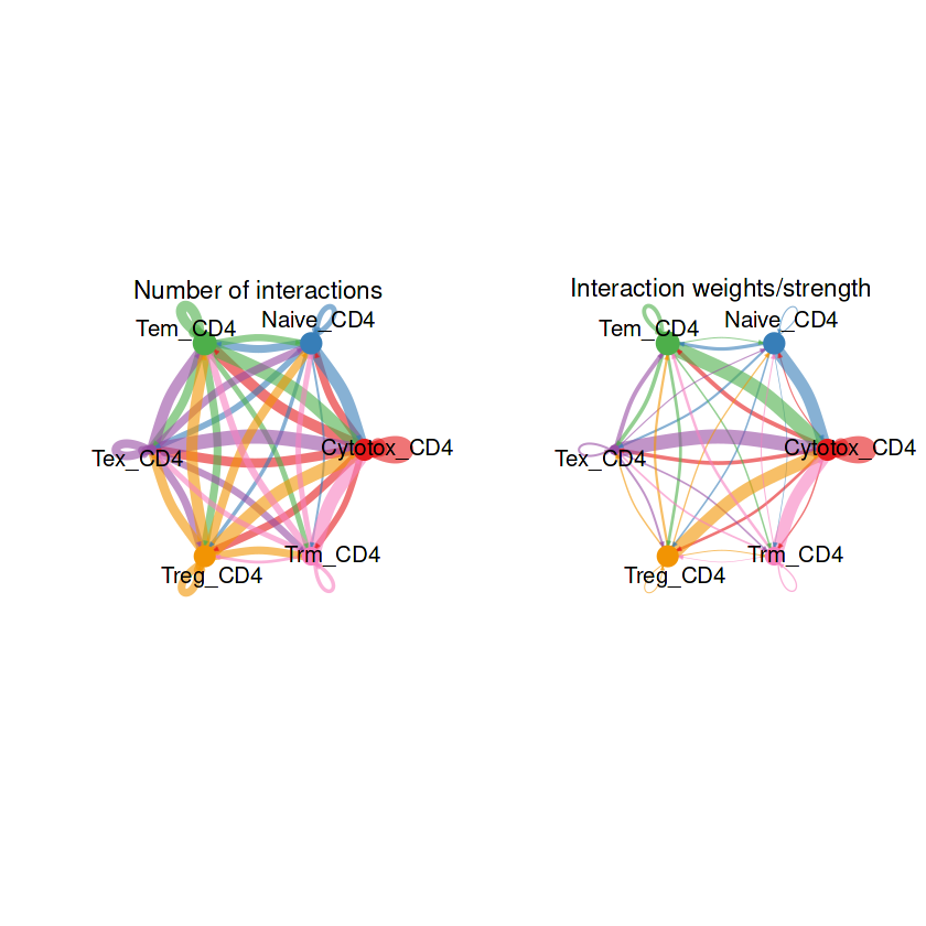
## 整体的弦图
groupSize <- as.numeric(table(RE_CD4@idents))
par(mfrow = c(1,2), xpd=TRUE)
netVisual_circle(RE_CD4@net$count, vertex.weight = groupSize, weight.scale = T, label.edge= F, title.name = "Number of interactions")
netVisual_circle(RE_CD4@net$weight, vertex.weight = groupSize, weight.scale = T, label.edge= F, title.name = "Interaction weights/strength")
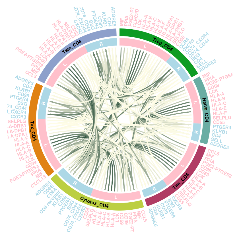
## 部分细胞的弦图
结果解读:这部分弦图是整体上观察每个细胞群之间的细胞通讯强度,线条越粗代表越强的通讯强度。接下来利用一些包让弦图的结果颜值更加高。
## 对这部分图片美化
#cellchat提取互作结果,这里我们选取了几种细胞
unique(RE_CD4@idents)
<ol class=list-inline><li>Treg_CD4</li><li>Naive_CD4</li><li>Trm_CD4</li><li>Cytotox_CD4</li><li>Tex_CD4</li><li>Tem_CD4</li></ol>
<summary style=display:list-item;cursor:pointer>
Levels:
</summary>
<ol class=list-inline>'Cytotox_CD4' 'Naive_CD4' 'Tem_CD4' 'Tex_CD4' 'Treg_CD4' 'Trm_CD4' </ol>
RE_CD4.com <- subsetCommunication(RE_CD4, sources.use = c("Treg_CD4","Naive_CD4","Trm_CD4","Cytotox_CD4","Tex_CD4","Tem_CD4"),
                              targets.use = c("Treg_CD4","Naive_CD4","Trm_CD4","Cytotox_CD4","Tex_CD4","Tem_CD4"))


#为了演示顺利不繁琐,我们对prob做了筛选,实际按照自己的想法即可,这里仅仅是为了减少结果
RE_CD4.com <- RE_CD4.com[RE_CD4.com$prob > 0.01,]
RE_CD4.com <- RE_CD4.com[,1:5]
整理数据,获取互作结构。整体的思路还是和之前的circle系列一样,需要获得扇区数据,整理我们需要获得这样的数据,首先需要一列基因,也就是受配体。然后一列是对其注释,表示这些基因哪些是ligand,哪些是receptor。最后还需要一列,表明这些受配体是哪些细胞中的,便于后续的注释
#整理plot的数据
library(dplyr)
library(tidyr)


result_df <- RE_CD4.com %>%
  pivot_longer(
    cols = c(ligand, receptor),
    names_to = "group",
    values_to = "gene"
  ) %>%
  mutate(
    cells = if_else(group == "ligand", source, target)
  ) %>%
  select(gene, group, cells) %>%
  distinct()  # 去重
载入程序包:‘tidyr’


The following object is masked from ‘package:igraph’:

    crossing
#按照plot顺序排序
#这里需要对celltype排序,可以自己调整需要展示的顺序
result_df <- result_df %>%
  mutate(
    cells = factor(cells, levels = c("Treg_CD4","Naive_CD4","Trm_CD4","Cytotox_CD4","Tex_CD4","Tem_CD4")),
    group = factor(group, levels = c("ligand",'receptor'))
  ) %>%
  arrange(cells, group)  # 先按celltype排序,再按group排序
#设置celltype颜色
group_colors <- c("Treg_CD4" = "#0e9c23",
                  "Naive_CD4"  = "#6aada3",
                  "Trm_CD4" = "#b03c64",
                  "Cytotox_CD4" = "#bccf42",
                  "Tex_CD4" = "#e08214",
                  "Tem_CD4" = "#8da0cb")


result_df$color <- group_colors[result_df$cells]

#设置受配体颜色
LR_color <- c("ligand" = "pink",
              "receptor" = 'lightblue')

result_df$LR_color <- LR_color[result_df$group]
head(result_df)
| gene | group | cells | color | LR_color |
|---|---|---|---|---|
| <chr> | <fct> | <fct> | <chr> | <chr> |
| MIF | ligand | Treg_CD4 | #0e9c23 | pink |
| PPIA | ligand | Treg_CD4 | #0e9c23 | pink |
| PGE2-PTGES3 | ligand | Treg_CD4 | #0e9c23 | pink |
| CLEC2D | ligand | Treg_CD4 | #0e9c23 | pink |
| LCK | ligand | Treg_CD4 | #0e9c23 | pink |
| HLA-A | ligand | Treg_CD4 | #0e9c23 | pink |
library(circlize)
library(ggsci)
#plot我们还是分扇区,这样做的好处是对图做了注释,就不用额外plot 没必要的legend了

circos.clear()#清空当前作图,便于新的circle plot
group_size <- table(result_df$cells)#这个是每个细胞大群也就是分组的size,这里就是包含的亚群数目,需要注意这个涉及到后面扇形分区,所以顺序要对
#设置布局
circos.par(start.degree = 90, cell.padding = c(0, 0, 0, 0), #其实位置,扇区内行距为0
           gap.after = 2,#设置每个扇区之间的gap,前面的扇区之间小一点,最后两个扇区也就是首尾的位置扇区开头大一点
           circle.margin = c(0.1, 0.1, 0.1, 0.1))#环形图距离画布的距离
#初始化plot
circos.initialize(factors = result_df$cells,#扇区scctor,这是已经排好序的数据
                  xlim = cbind(0, group_size))#每个扇区xlim,每个扇区元素不同,所以每个扇区的xlim是0到扇区元素长度


#plot最外层受配体基因,并区别颜色

circos.track(
  ylim = c(0, 1), #y轴范围
  bg.border = NA, #不要背景
  track.height = 0.01,#贵高高度

  panel.fun = function(x, y) {

    sector_index = get.cell.meta.data("sector.index") #获取当前扇区index
    group_size = group_size[sector_index] #获取当前扇区长度

    #适用循环plot 文字,因为是多个扇区
    for (i in 1:group_size) {
      circos.text(
        x = i - 0.5, #位于中间
        y = 0.5, #y轴位置
        labels = result_df$gene[result_df$cells == sector_index][i], #标注,索引到扇区对应的亚群
        col= result_df$LR_color[result_df$cells == sector_index][i],
        font = 2,#文字加粗
        facing = "reverse.clockwise", #文字排布方式向外
        niceFacing = TRUE,
        adj = c(1, 0.5),
        cex = 0.8)#文字大小
    }
  }
)

#第二轨道,添加celltype注释
##因为我们是按照扇区来plot的,所以添加group注释就很简单了

circos.track(ylim = c(0, 1),
             bg.border = NA,
             track.height = 0.08,
             bg.col=group_colors,#分组注释背景颜色


             panel.fun=function(x, y) {

               xlim = get.cell.meta.data("xlim") #获取当前扇区x,y范围
               ylim = get.cell.meta.data("ylim")

               sector.index = get.cell.meta.data("sector.index")#扇区索引
               circos.text(mean(xlim),#取mean,文字位于中心
                           mean(ylim),
                           sector.index, #label就是扇区索引
                           col = "black", #文字颜色
                           cex = 0.8,
                           font=2,
                           facing = 'bending.inside',
                           niceFacing = TRUE)
             })

#第三轨道,添加受配体注释
##因为我们是按照扇区来plot的,所以添加group注释就很简单了

lables_LR <- c("L","R")

circos.track(

  #基本设置
  ylim = c(0,1),
  bg.border = NA,
  track.height = 0.08,


  panel.fun = function(x, y) {

  sector_index = get.cell.meta.data("sector.index")#扇区索引
  group_data = result_df[result_df$cells == sector_index, ]#获取当前扇区数据

  #提取当前扇区受配体格式,我们前面已经设定是按照ligand receptor排序的,所以这里plot的时候坐标好确定
  LR = table(group_data$group)
  xleft = as.vector(c(0,LR)) #起始位置,0和ligand的数量位置
  xright  = cumsum(LR)#终止位置,ligand数量和LR总数目

    for (i in 1:2) {
      circos.rect(
        xleft = xleft[i], #左侧位置
        xright = xright[i],#右侧位置
        ybottom = 0,#
        ytop = 1,#
        col = LR_color[i], #对应得颜色设置
        border = NA
      )

      circos.text(xleft[i] + xleft[i+1]/2,#取mean,文字位于中心
                  0.5,
                  lables_LR[i], #label就是扇区索引
                  col = "white", #文字颜色
                  cex = 0.8,
                  font=2,
                  facing = 'bending.inside',
                  niceFacing = TRUE)


    }
  }
)

##添加互作连线
#互作信息在最开始的cellchat结果中,包含互作每种celltype受配体以及互作强度
#这里需要注意,对这个数据做好排序,因为前面我们做扇区的时候数据是经过排序的
#素以这里只要保证source的顺序和扇区一致即可
RE_CD4.com <- RE_CD4.com %>%
  mutate(
    source = factor(source, levels = c("Treg_CD4","Naive_CD4","Trm_CD4","Cytotox_CD4","Tex_CD4","Tem_CD4"))
  )%>%
  arrange(source)


col_fun = colorRamp2(range(RE_CD4.com$prob), c("#FFFDE7", "#013220"))


# 添加互作连线
for(i in 1:nrow(RE_CD4.com)) {
  # 获取起始位置信息
  source <- as.character(RE_CD4.com$source[i])  # 确保转换为字符
  ligand <- as.character(RE_CD4.com$ligand[i])

  # 找到在 result_df 中的索引(确保因子水平一致)
  from_subset <- result_df[result_df$cells == source, ]
  from_idx <- which(from_subset$gene == ligand)

  # 获取目标位置信息
  target <- as.character(RE_CD4.com$target[i])
  receptor <- as.character(RE_CD4.com$receptor[i])

  to_subset <- result_df[result_df$cells == target, ]
  to_idx <- which(to_subset$gene == receptor)


  #这里我们需要添加一个判断,因为有时候有的受配体是相同的
  #这种情况下,索引就会出现两个位置,导致plot出错
  if(identical(ligand, receptor)==FALSE){

    # 计算在各自扇区中的位置(从0开始计数)
    from_pos <- from_idx - 0.5
    to_pos <- to_idx - 0.5

  }else{

    from_pos <- from_idx[1] - 0.5
    to_pos <- to_idx[2] - 0.5

  }


  # 添加连线,这里需要注意,其实有些函数里面,箭头plot出来不是很好,肯定相干参数调整
  circos.link(
    sector.index1 = source,  # 起始扇区
    point1 = from_pos,         # 起始位置
    sector.index2 = target,   # 目标扇区
    point2 = to_pos,           # 目标位置
    col = col_fun(RE_CD4.com$prob[i]),  # 连线颜色,互作强度
    lwd = 2,#粗细
    directional = 1,#连线箭头,0表示没有箭头,1表示从point1 to point2方向箭头,-1则相反。2表示双向箭头
    arr.length=0.2,#箭头长度
    arr.width=0.1#箭头宽度
  )
}
# 添加图例
legend_in_plot <- F

if(legend_in_plot) {
  lgd <- Legend(title ="Score", col_fun = col_fun, direction="horizontal", border="black")
  grid.draw(lgd)

  legend(1.1,0.5, pch=15, legend=c("Ligand","Receptor"), bty="n",
         col =c("pink","lightblue"), cex=1, pt.cex=3, border="black")

  legend(1.1,0, pch=20, legend=names(group_colors), bty="n",
         col = group_colors, cex=1, pt.cex=3, border="black")
} else {
  pdf("cd4_all_legend.pdf", width = 4, height = 4)
  grid.draw(Legend(title ="Score", col_fun = col_fun, direction="horizontal", border="black"))
  dev.off()
}
plot_cellchat_circos <- function(communication_data, cell_groups = NULL, legend_in_plot = FALSE) {
  library(circlize)
  library(ComplexHeatmap)
  library(dplyr)
  library(grid)

  # 仅保留互作概率 > 0.01 的数据
  communication_data <- communication_data %>% filter(prob > 0.01)

  # 整理数据,拆分 Ligand 和 Receptor
  result_df <- communication_data %>%
    pivot_longer(cols = c(ligand, receptor), names_to = "group", values_to = "gene") %>%
    mutate(cells = if_else(group == "ligand", source, target)) %>%
    select(gene, group, cells) %>%
    distinct()

  # 确保所有 source 和 target 细胞都包含
  all_cells <- unique(c(communication_data$source, communication_data$target))

  # 如果用户提供了细胞组信息,则按照 cell_groups 重新排序
  if (!is.null(cell_groups)) {
    ordered_cells <- intersect(cell_groups, all_cells)  # 仅保留数据中存在的细胞
  } else {
    ordered_cells <- all_cells  # 否则按照默认顺序
  }

  # 设定细胞因子顺序
  result_df <- result_df %>%
    mutate(
      cells = factor(cells, levels = ordered_cells),
      group = factor(group, levels = c("ligand", "receptor"))
    ) %>%
    arrange(cells, group)

  # 颜色设置
  group_colors <-  pal_nejm("default")(length(ordered_cells))
  names(group_colors) <- ordered_cells

  LR_color <- c("ligand" = "pink", "receptor" = "lightblue")
  result_df$color <- group_colors[result_df$cells]
  result_df$LR_color <- LR_color[result_df$group]

  # 计算每个细胞组的基因数量
  group_size <- table(result_df$cells)

  # Circos 初始化
  circos.clear()
  circos.par(start.degree = 90, cell.padding = c(0, 0, 0, 0), gap.after = 2, circle.margin = c(0.1, 0.1, 0.1, 0.1))
  circos.initialize(factors = result_df$cells, xlim = cbind(0, group_size))

  ## **第一层:受体和配体基因**
  circos.track(
    ylim = c(0, 1), bg.border = NA, track.height = 0.01,
    panel.fun = function(x, y) {
      sector_index <- get.cell.meta.data("sector.index")
      group_size <- group_size[sector_index]
      for (i in 1:group_size) {
        circos.text(
          x = i - 0.5, y = 0.5,
          labels = result_df$gene[result_df$cells == sector_index][i],
          col = result_df$LR_color[result_df$cells == sector_index][i],
          font = 2, facing = "reverse.clockwise", niceFacing = TRUE,
          adj = c(1, 0.5), cex = 0.8
        )
      }
    }
  )

  ## **第二层:细胞类型注释**
  circos.track(ylim = c(0, 1), bg.border = NA, track.height = 0.08, bg.col = group_colors,
               panel.fun = function(x, y) {
                 sector.index <- get.cell.meta.data("sector.index")
                 circos.text(mean(get.cell.meta.data("xlim")), mean(get.cell.meta.data("ylim")),
                             sector.index, col = "black", cex = 0.8, font = 2,
                             facing = 'bending.inside', niceFacing = TRUE)
               })

  ## **第三层:受体-配体注释**
  labels_LR <- c("L", "R")
  circos.track(
    ylim = c(0,1), bg.border = NA, track.height = 0.08,
    panel.fun = function(x, y) {
      sector_index <- get.cell.meta.data("sector.index")
      group_data <- result_df[result_df$cells == sector_index, ]
      LR_counts <- table(group_data$group)

      xleft <- c(0, LR_counts[1])
      xright <- cumsum(LR_counts)

      for (i in 1:2) {
        circos.rect(
          xleft = xleft[i], xright = xright[i], ybottom = 0, ytop = 1,
          col = LR_color[i], border = NA
        )
        circos.text(xleft[i] + LR_counts[i]/2, 0.5, labels_LR[i], col = "white",
                    cex = 0.8, font = 2, facing = 'bending.inside', niceFacing = TRUE)
      }
    }
  )

  ## **添加细胞间互作连线**
  col_fun <- colorRamp2(range(communication_data$prob), c("#FFFDE7", "#013220"))

  for (i in 1:nrow(communication_data)) {
    source <- as.character(communication_data$source[i])
    ligand <- as.character(communication_data$ligand[i])
    from_subset <- result_df[result_df$cells == source, ]
    from_idx <- which(from_subset$gene == ligand)

    target <- as.character(communication_data$target[i])
    receptor <- as.character(communication_data$receptor[i])
    to_subset <- result_df[result_df$cells == target, ]
    to_idx <- which(to_subset$gene == receptor)

    if (identical(ligand, receptor) == FALSE) {
      from_pos <- from_idx - 0.5
      to_pos <- to_idx - 0.5
    } else {
      from_pos <- from_idx[1] - 0.5
      to_pos <- to_idx[2] - 0.5
    }

    circos.link(source, from_pos, target, to_pos,
                col = col_fun(communication_data$prob[i]), lwd = 2,
                directional = 1, arr.length = 0.2, arr.width = 0.1)
  }

  ## **添加图例**
  if (legend_in_plot) {
    lgd <- Legend(title ="Score", col_fun = col_fun, direction="horizontal", border="black")
    grid.draw(lgd)
  } else {
    pdf("legend.pdf", width = 4, height = 4)
    grid.draw(Legend(title ="Score", col_fun = col_fun, direction="horizontal", border="black"))
    dev.off()
  }
}
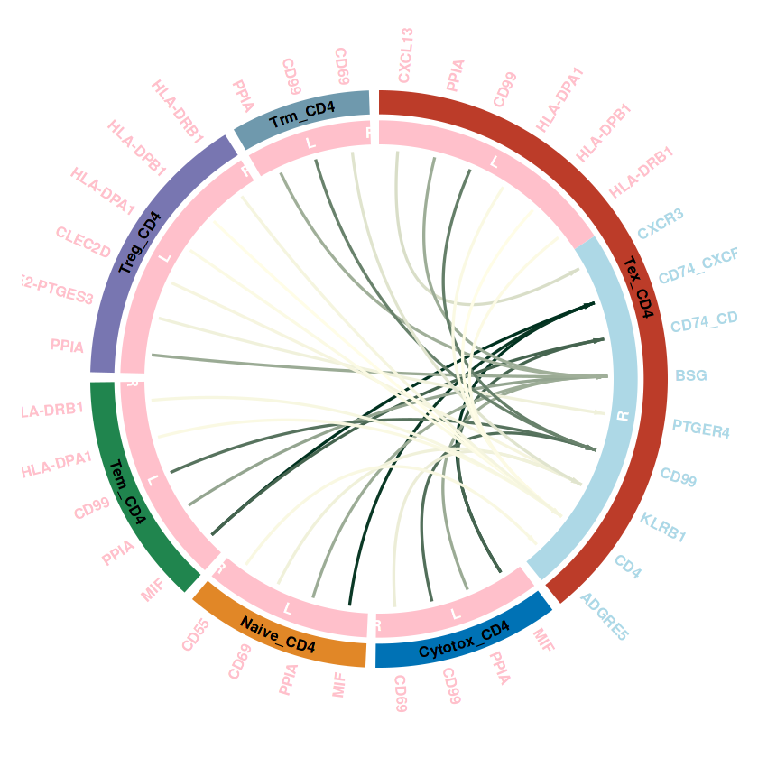
## 单个的优化
# communication_data是提取之后的结果
communication_data <- subsetCommunication(RE_CD4, sources.use = c("Treg_CD4","Naive_CD4","Trm_CD4","Cytotox_CD4","Tex_CD4","Tem_CD4"),
                              targets.use = c("Tex_CD4"))
## 调用刚才的函数
plot_cellchat_circos(communication_data, legend_in_plot = F)
head(result_df)
Note: 1 point is out of plotting region in sector 'Cytotox_CD4', track
'3'.

Note: 1 point is out of plotting region in sector 'Naive_CD4', track
'3'.

Note: 1 point is out of plotting region in sector 'Tem_CD4', track '3'.

Note: 1 point is out of plotting region in sector 'Treg_CD4', track
'3'.

Note: 1 point is out of plotting region in sector 'Trm_CD4', track '3'.
pdf: 2
| gene | group | cells | color | LR_color |
|---|---|---|---|---|
| <chr> | <fct> | <fct> | <chr> | <chr> |
| MIF | ligand | Treg_CD4 | #0e9c23 | pink |
| PPIA | ligand | Treg_CD4 | #0e9c23 | pink |
| PGE2-PTGES3 | ligand | Treg_CD4 | #0e9c23 | pink |
| CLEC2D | ligand | Treg_CD4 | #0e9c23 | pink |
| LCK | ligand | Treg_CD4 | #0e9c23 | pink |
| HLA-A | ligand | Treg_CD4 | #0e9c23 | pink |
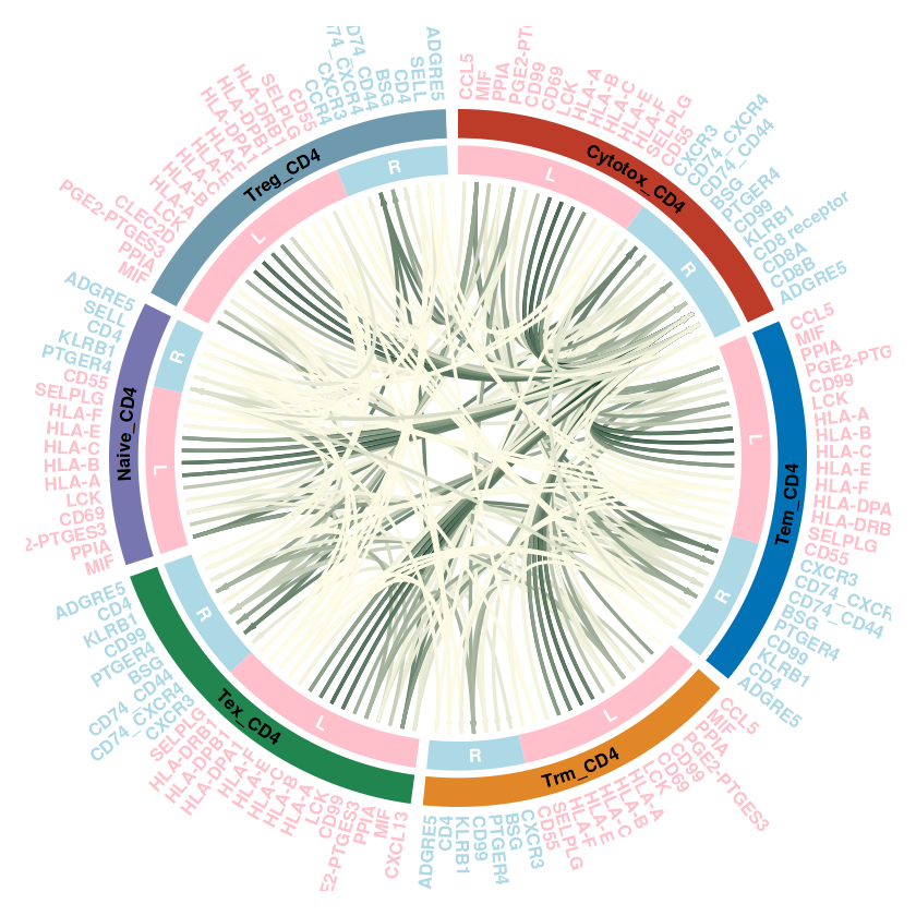
communication_data <- subsetCommunication(RE_CD4, sources.use = c("Treg_CD4","Naive_CD4","Trm_CD4","Cytotox_CD4","Tex_CD4","Tem_CD4"),
                              targets.use = c("Treg_CD4","Naive_CD4","Trm_CD4","Cytotox_CD4","Tex_CD4","Tem_CD4"))
## 调用刚才的函数
plot_cellchat_circos(communication_data, legend_in_plot = F)
pdf: 2
RE_CD4@netP$pathways
<ol class=list-inline><li>‘MHC-I’</li><li>‘MIF’</li><li>‘CD99’</li><li>‘CypA’</li><li>‘Prostaglandin’</li><li>‘MHC-II’</li><li>‘CLEC’</li><li>‘LCK’</li><li>‘ADGRE’</li><li>‘CXCL’</li><li>‘SELPLG’</li><li>‘CCL’</li><li>‘SIRP’</li><li>‘IL16’</li></ol>
pathways.show <- c("MHC-II")
netVisual_aggregate(RE_CD4, signaling = pathways.show)

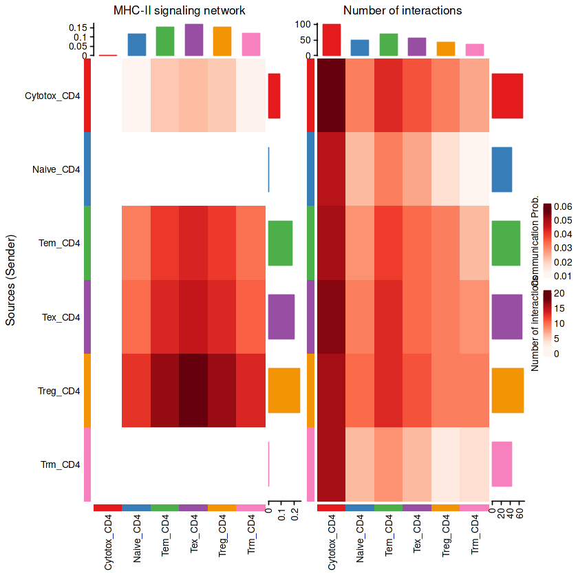
热图
#展示所有
p1 = netVisual_heatmap(RE_CD4, signaling = pathways.show,color.heatmap = "Reds")
p2 = netVisual_heatmap(RE_CD4,color.heatmap = "Reds")
p1+p2
Do heatmap based on a single object


Do heatmap based on a single object
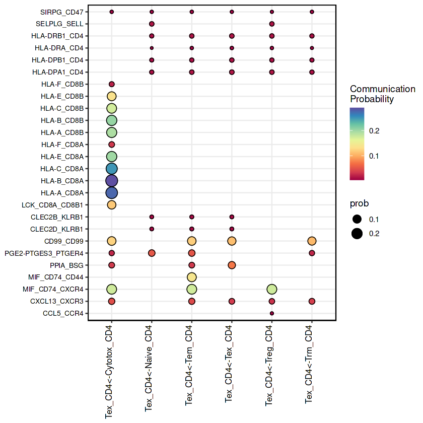
气泡图
netVisual_bubble(RE_CD4, sources.use = "Tex_CD4", remove.isolate = FALSE)
Comparing communications on a single object
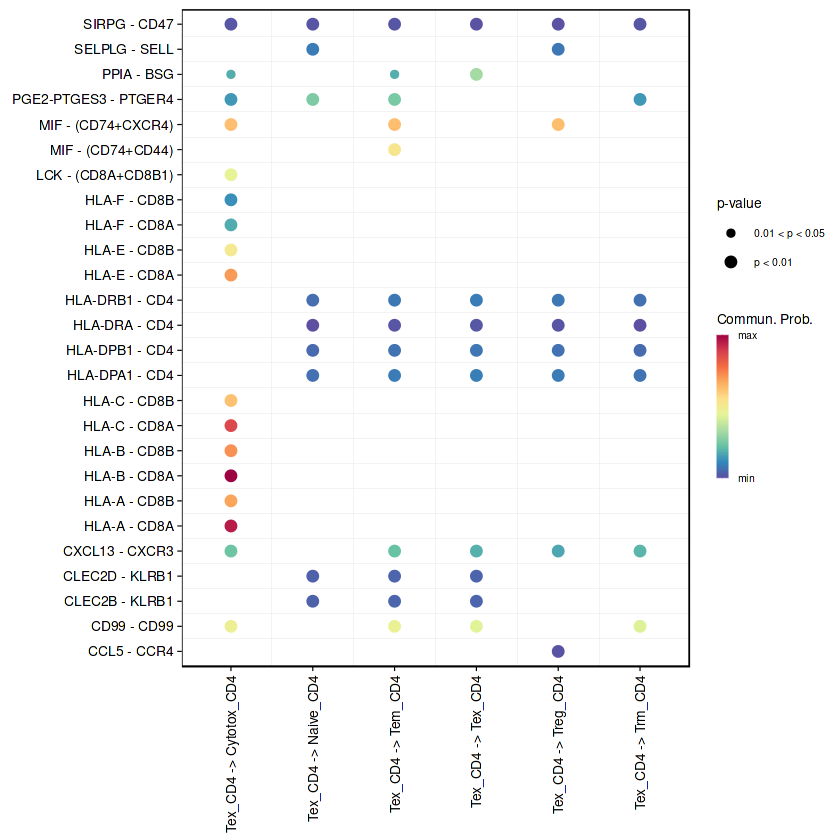
## 气泡图的美化
RE_CD4.net <- subsetCommunication(RE_CD4)
Tex_CD4_net <- subset(RE_CD4.net, source=='Tex_CD4')
Tex_CD4_net$cell_inter <- paste0(Tex_CD4_net$source,"<-",Tex_CD4_net$target)#增加一列,展示source-target
#ggplot2作图
ggplot(Tex_CD4_net,aes(x=cell_inter,y=interaction_name)) +
  geom_point(aes(size=prob,color=prob)) +
  geom_point(shape=21,aes(size=prob))+
  scale_color_gradientn('Communication\nProbability',
                        colors=colorRampPalette(RColorBrewer::brewer.pal(10, "Spectral"))(100)) +
  theme_bw() +
  theme(axis.text=element_text(size=10, colour = "black"),
        axis.text.x = element_text(angle = 90, hjust = 1, vjust = 0, size=10),
        axis.text.y = element_text(size=8, colour = "black"),
        axis.title=element_blank(),
        panel.border = element_rect(size = 0.7, linetype = "solid", colour = "black"))